
Reaktr Landing Page
Brand Identity • UI Design • Landing Page
I redesigned the REAKTR landing page to help elevate the brand presence, communicate the platform’s innovation, and create an immersive, high-performance digital experience.
ROLE
Type
UI Design
AI Platform
THE OVERVIEW
Reaktr is an AI-powered platform built to help organizations analyze data, predict outcomes and automate decisions in real time. needed a visual refresh that positioned the platform as modern, intelligent, and enterprise-ready.
The goal was to redesign the landing experience to better reflect the technology, build trust with enterprise users, and drive engagement through a clear compelling flow.
THE APPROACH
Created a modern, tech-forward experience that balances innovation with clarity. The redesign focuses on storytelling, strong hierarchy, and immersive visuals to communicate complex technology in a simple, engaging way.
Brand-Forward Design
Clear Storytelling
Immersive Visuals
Scalable System
Conversion Focused

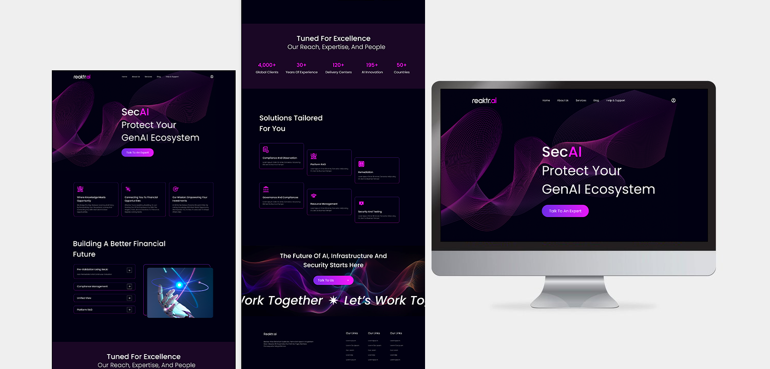
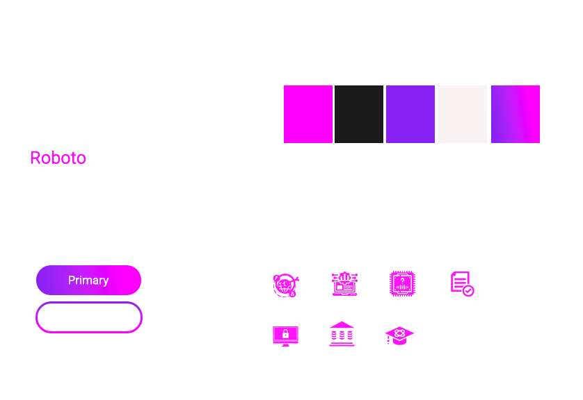
VISUAL SYSTEM
A cohesive visual system was developed to create a consistent and futuristic brand experience across the digital platform.
The visual direction focused on restraint and clarity. Instead of relying on heavy visual effects, the experience was designed around strong typography, intentional spacing, dark UI foundations, and a minimal neon-accent palette.
DESIGN PROCESS & INTENT
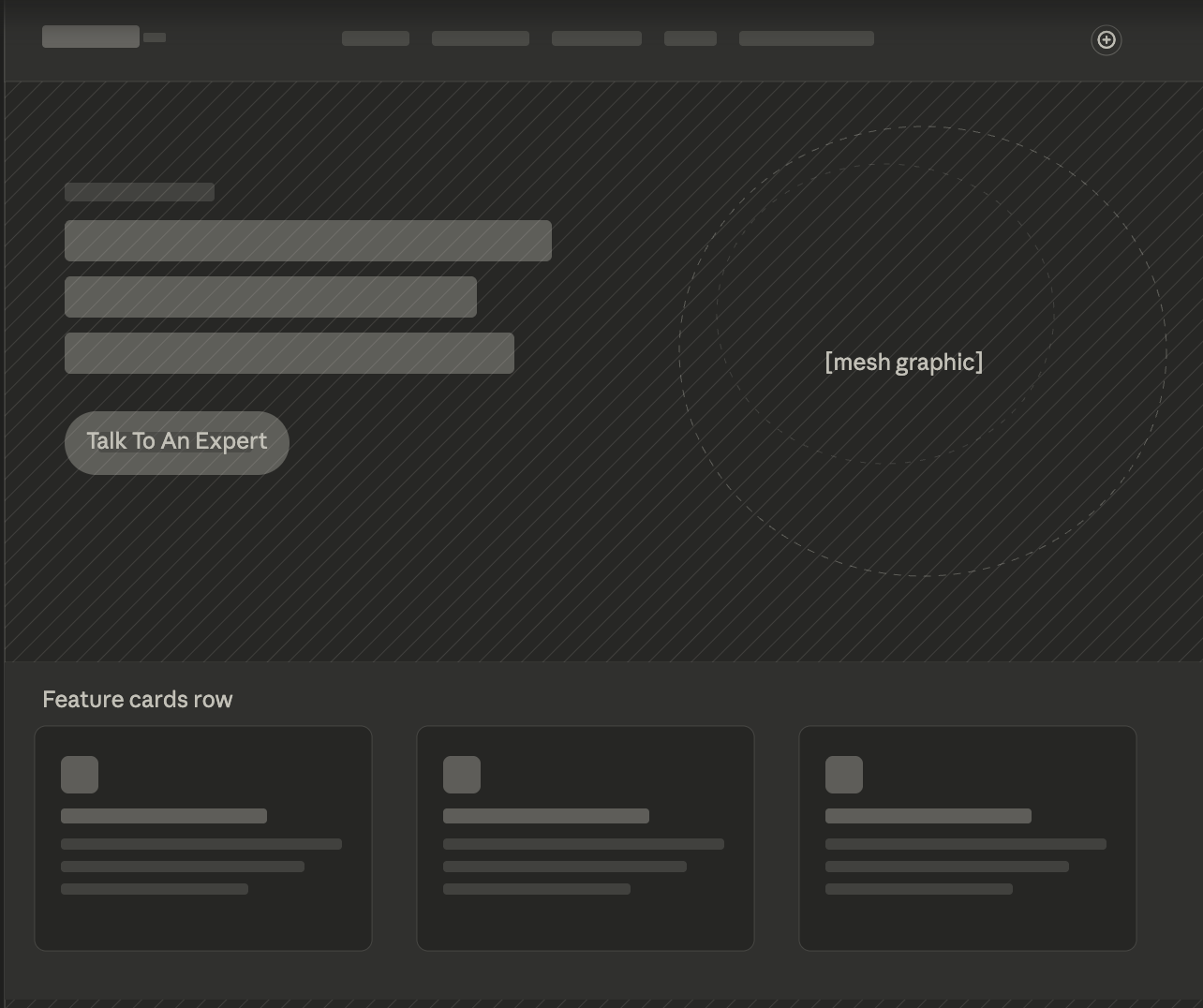
The project began with exploring how AI companies visually communicate trust and innovation without overwhelming users. Early wireframes focused on simplifying information architecture and improving content flow across the landing page.
The result was a cleaner interface that allowed the product messaging and technology to take center stage.
Key design decisions included:
Dark-mode inspired UI for a modern AI aesthetic
Simplified layouts with stronger hierarchy
Geometric graphic elements to reinforce innovation
Consistent spacing and component structure
Bold accent colors used sparingly for emphasis

DESIGN EVOLUTION
The design system evolved into a modular structure that could scale across additional marketing pages and future product experiences.
Deliverables included:
Landing page redesign concepts
Visual identity direction
Typography and color exploration
UI component styling
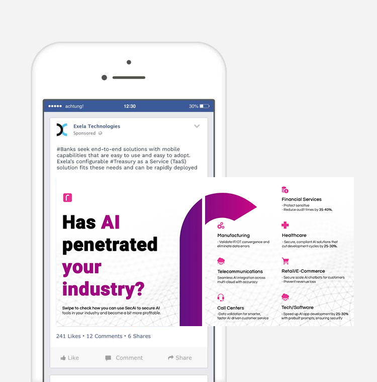
Social and promotional mockups
KEY INSIGHT/OUTCOME
The redesigned landing page established a stronger visual foundation for the brand and created a more cohesive user experience across marketing touchpoints. The updated direction improved visual consistency, elevated the perception of the product, and provided a scalable system for future design expansion.