Exela Presentation Revamp
Exela Technologies needed their sales deck to catch up to the brand. The existing presentation was dated and visually inconsistent with the image of a modern technology company — so I was brought in to redesign it from the ground up.
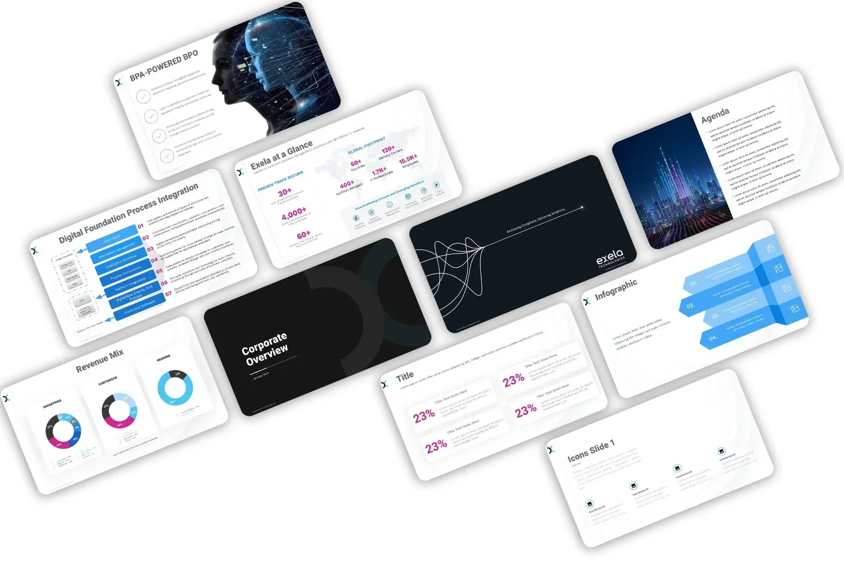
My approach centered on two priorities: making it look the part, and making it work for the people using it. On the visual side, I developed a futuristic, tech-forward design language — dark backgrounds, sharp typography, structured layouts — that aligned the deck with where Exela was positioning itself in the market.
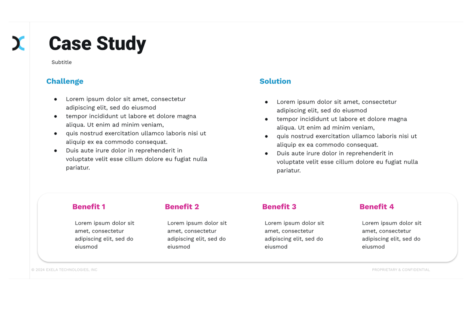
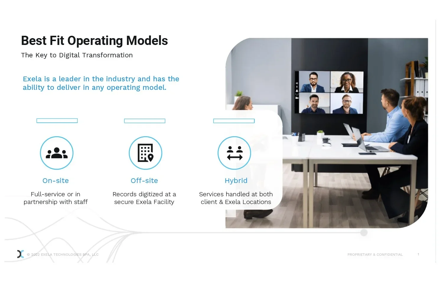
The usability side was equally important. Because multiple sales reps would be working from the same template, I designed every slide to be easy to edit without breaking the design. Modular layouts, consistent type styles, and clear placeholder structures meant the team could update content confidently, without needing a designer in the room.
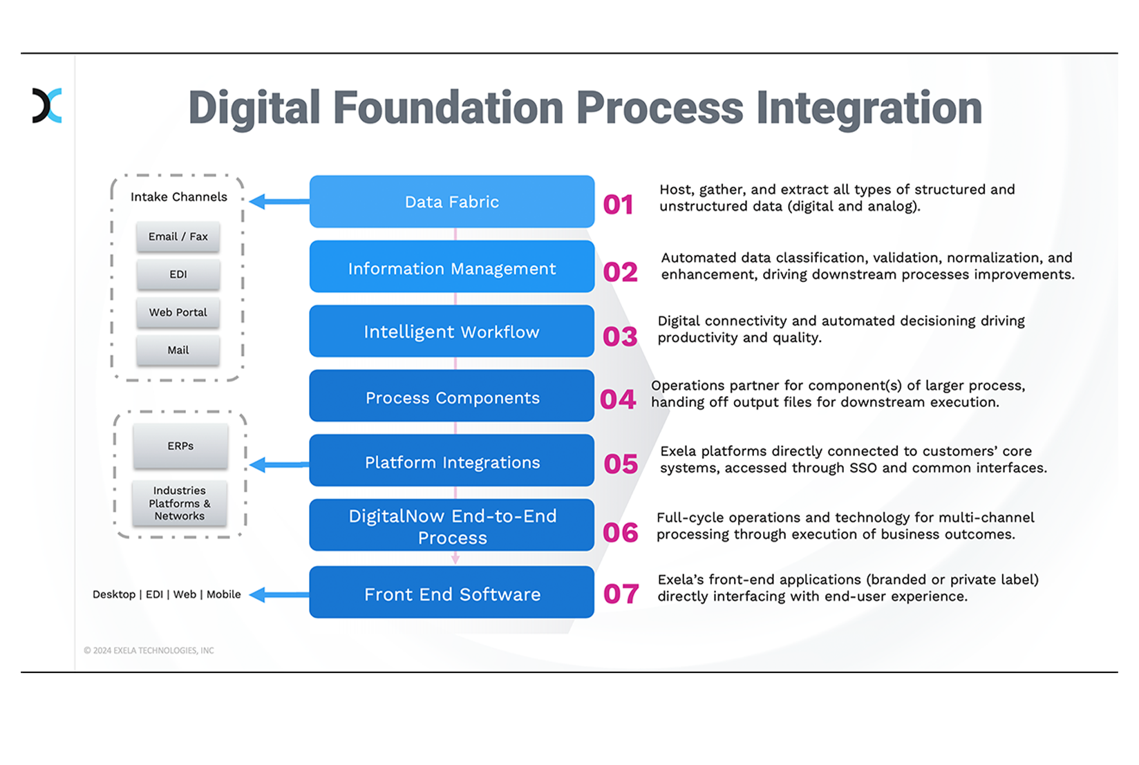
The most interesting challenge was the content-heavy slides — data comparisons, process flows, technical breakdowns — where the information couldn't be simplified, only clarified. I used hierarchy, whitespace, and strategic color to create clear visual paths through complex material, so prospects could follow along in a live setting without getting overwhelmed.
The final deck gave the sales team a presentation that looked as advanced as the technology they were selling — and was built to be maintained by the people actually using it.
Digital • Illustrator • Presentation • Figma